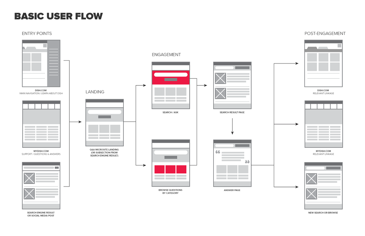
In early 2016, I was engaged by the Dish team at Havas to develop a user experience for a Q&A feature on Dish.com. The ask was to create an experience that would resolve basic technical issues while at the same time provide more detailed information around Dish's various offerings.

Realizing that customers often arrive at a cable provider's FAQ page at a point of frustration, I felt it important to provide a bird's eye view of all the content on the landing page, creating high level buckets for the most common questions.
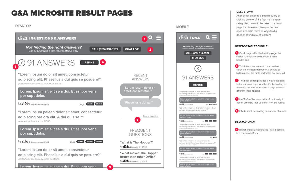
Through the use of clickable "tags" and related content modules, the user is never presented with a dead end. The idea being to make the entire experience highly clickable and reduce the need to use a new search to narrow content.
PROJECT INFORMATION:
CLIENT: DISH NETWORK
ROLES: UX
CLIENT: DISH NETWORK
ROLES: UX